
A custom backpack isn’t just a container for a laptop and a stray water bottle; it’s a moving canvas. Think about it, whether someone is shuffling through a crowded morning transit station, walking into a corporate boardroom, or heading to a campus lecture, a bag sits directly in the line of sight of everyone walking behind them. Unlike standard swag items that get thrown into a junk drawer and forgotten, a solid, well-made pack sticks around for years, giving a brand continuous, real-world exposure.
But here’s the catch: simply slapping a massive logo right in the middle of a cheap nylon pocket doesn’t work anymore. People won’t wear it. If you want people to actually integrate a bag into their daily routine, you have to strike a balance between retail-level aesthetics and structural reality. Let’s break down how to design a custom backpack that stands out for the right reasons.
1. Finding the Right Structural Canvas for Your Purpose
Before you even touch a color wheel or start playing with typography, you have to figure out the actual physical bag you’re treating as your canvas. The material and shape completely dictate how your artwork will stretch, fold, or look when the bag is stuffed to capacity.
- Classic Commuter Backpacks: These are your structured, multi-compartment bags with flat panels and laptop sleeves. They offer a predictable print surface, making them perfect for clean, geometric corporate branding or minimalist designs.
- Minimalist Drawstring Bags: These offer a completely uninterrupted canvas. Because they’re flexible and budget-friendly, they act as an excellent backdrop for massive, vibrant graphic illustrations or high-energy event merchandise.
- Heavy-Duty Outdoor Rucksacks: Dominated by straps, loops, and rugged, textured fabrics like Cordura or ripstop. Big, plastisol screen prints will look out of place here. Instead, these bags look best with subtle, monochromatic tones or tactile, stitched-on patches.
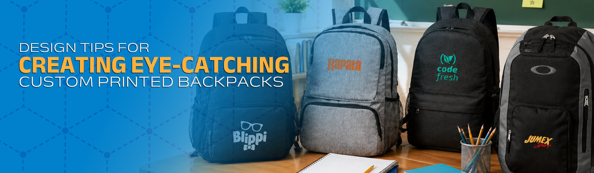
2. Strategic Logo Placement on Backpacks
Placement can make or break the premium feel of a piece of gear. Smart logo placement on backpacks ensures your branding stays perfectly legible without making the wearer feel like a walking billboard.
The Upper-Center Panel (The Premium Zone)
The top third of a bag’s main compartment is prime real estate. When someone is standing in line or walking ahead of a crowd, this area naturally draws the eye. Because it sits above the natural slouch or fold of the fabric, graphics placed here stay flat and readable from a distance.
The Front Utility Pocket (The Center Stage)
The lower pocket is a natural focal point because it’s an independent, flat surface. It’s highly accommodating for wider layout styles or complete typography setups. Just be sure to leave a little breathing room near the zipper track so your design elements don’t accidentally get clipped or distorted during the manufacturing process.
Asymmetrical and Subtle Accent Zones
If you are designing for a modern, retail-conscious crowd, try moving away from the dead-center look. Some of the best backpack branding ideas rely on subtlety. Try running clean typography vertically along a side profile panel, tucking a tiny embroidered emblem into the lower right corner, or printing a subtle graphic directly onto a shoulder strap for head-on visibility.
3. Master the Spectrum of Backpack Printing Techniques
You can’t treat every bag material the same way. The fabric composition whether it’s raw canvas, heavy nylon, or smooth polyester tells you exactly which production path to take.
A Quick Reality Check on Materials Polyester and nylon are notorious for reacting poorly to high heat. If you try to run a high-heat plastisol transfer on a thin polyester bag, you run the risk of scorching the fabric or triggering “dye migration”—where the chemical dye of the bag bleeds right up into your crisp white print, turning it a muddy grey.
- Screen Printing: This remains the undisputed king for massive production runs. It lays down incredibly vibrant, thick ink layers that look spectacular on cotton canvas and heavy blends. Keep your artwork restricted to solid, distinct colors for this method.
- Dye Sublimation: If you are working with a white polyester base and want an all-over, edge-to-edge pattern, this is your route. The ink chemically bonds with the synthetic fibers. The result? A print that literally cannot crack, flake, or peel off over time.
- Direct-to-Film (DTF) Transfers: This is the modern go-to for complex graphics. It beautifully preserves high-resolution photographic gradients, fine detail, and sharp multicolored artwork on tricky synthetic fabrics.
- Embroidered & Woven Patches: It’s not a print, but it’s incredibly effective. Stitching a dense woven patch onto a coarse nylon bag instantly elevates the perceived retail value of the product, adding a tactile texture you can’t get from ink.
4. Color Theory and Contrast Management
Backpacks live a rough life. They get dragged across floors, tossed into trunks, exposed to the sun, and rained on. Your color choices need to look sharp on day one, but they also need to survive real-world wear while remaining readable from twenty feet away.
If you are using a dark canvas like midnight black or charcoal, make your artwork pop with high-visibility accents, think optic white, electric teal, or vibrant safety orange. If the bag itself is a bright color, ground your design with deep navy or solid black graphics. Always run your digital files through a basic contrast checker before finalizing, and request physical sample swatches to see exactly how the ink behaves on the dyed yarn.
5. Incorporating Smart Functional Typography
When text is the focal point of your bag, legibility has to trump fancy styling. Delicate script fonts or ultra-thin serif lettering have a bad habit of blurring together when they are pressed onto coarse, textured fabrics.
Stick to clean, highly legible sans-serif typefaces like Montserrat, Helvetica, or Futura for your primary text. If your branding absolutely requires intricate line work or elegant script details, save those elements for high-density DTF printing or laser-etched panels where a machine can preserve those razor-sharp edges.
6. Executing Creative Promotional Backpack Design Tips
When you’re designing bags for a widespread promotional giveaway, shift your strategy away from cold, corporate layouts and lean toward lifestyle design.
- Bring in Reflective Materials: Use retroreflective inks or metallic vinyl elements for parts of your design. It looks sleek and technical during the day, but it adds actual safety utility for cyclists and night commuters.
- Play with Tone-on-Tone Patterns: Instead of plastering one giant logo on the front, try running a subtle, muted step-and-repeat pattern across the face of the bag. Then, drop a tiny, high-contrast version of your primary emblem on an accent tag for a retail-grade look.
- Don’t Forget the Inside: Surprise people by printing a vibrant splash of color or a stylized pattern on the interior liner fabric. It’s an unexpected detail that makes the entire product feel premium, custom-made, and thoughtfully engineered.
Moving From Digital Proof to Production
At the end of the day, a great design is only as good as its real-world execution. Take your time mapping the layout, pick a printing technique that actually matches your fabric, and keep your typography incredibly clean.